Saturday, September 19, 2020

That time I nearly wrote a solo zine

I still want to do a solo zine that is easy/cheap to mail in physical form, but for now it's on hold awaiting inspiration. In the meantime, I once did a survey in which I asked people what they wanted in a solo adventure zine. Let's see the stats first and then I have more to say.

Survey Says

  • Sample size around 75 people.
  • Only 17.5% want it tied to a system. 45% prefer it to loosely refer to a system.
  • 55% want a unique and flavorful setting, 20% want a D&D style setting, 25% want something else (rotating, SF, etc.)
  • 52.5% want 1-2 hours of playtime material, 42.5% want 3-5.
  • 60% prefer self contained adventures, 15% want continuity, 25% don’t care.
  • PDF is preferred, about 17.5% want to be sent paper. Many asked for phone/tablet/Kindle friendly.
  • 25% want graphic content, 22.5% want it kid friendly, everyone else is in-between.

Comments

  • "Include mysteries and puzzles"
  • "Build a setting over time"
  • "Endings are cool, and rarely carried off well” 
  • And while they wasn't anything particularly quotable on this front, about 10% of the responders expressed a desire for hard or semi-hard science fiction. I feel like there is a real (and probably loyal) audience there waiting on someone.

Themes and Formats

I really think I'm waiting on something to grab me, theme-wise. My original thoughts were a) a magical realism story involving a homeless guy who, due to mental illness (or superpower, take your pick) can see into other realities. And b) a weirdo sf-fantasy setting inspired by Zothique, Barsoom, Dune, etc. I'm not sure if I have the chops to carry off either! 

Some other things to think about in my laundry list of musings:
  • Paper map and stand-up minis/counters, or more choose your own adventure style text-based with illustrations?
  • Stand-alone scenarios loosely tied together in the same world or a true ongoing adventure? If the latter, "seasons" of 12 issues or just commit and keep going?
  • Envelope size? I want to use a standard stamp. But I could probably do it with either business envelopes (2-4 tri-folded full-size pages) or with a birthday or thank you card sized envelope and a small stapled (or not) booklet. A thank you card envelope might even work with a folded one-page zine like the Pocket-Mod format.
So you can see why I this project is still on the back burner for me. I got a little overwhelmed with choices. I need one thing to "lock in" to move forward: format or theme. 

I hope some of this has proved useful to you in some form. If you are a creator thinking of making a zine, have you thought about a solo adventure zine? Seems like a good time for one!

[Edit: boy was I right. There was an explosion of solo zines around this time.]

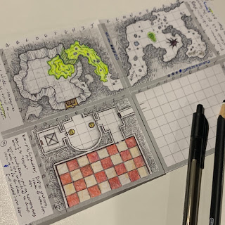
Playing around with hand-drawing a PocketMod for solo play.


Tuesday, August 25, 2020

Yet another way to generate D&D stats

 TLDR: what it says on the tin. But this time it's a kind of fun sub-game around rolling 'down the line' (stats in order).

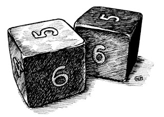
Art by William McAusland, used by permission.

Roll 2d6 for each of the six stats, one at a time. You can choose the order, but name each one before rolling. With each roll, assign a third number from an array of fixed outcomes: 1, 2, 3, 4, 5, 6. You can use each number in the array only once and can add only one number to each roll. Complete each stat before rolling the next one. No retracing your steps! 

Example: 
 
STR: 5+4=9, +3 = 12 
DEX: 5+5=10, +1 = 11
INT: 4+3=7, +2 = 9 (This is where things turn. I was hoping for a wizard but using up my 6 would only get me to 13, so I punted.)
WIS: 5+3=8, +6 = 14 (Cleric?)
CON: 5+1=6, +5 = 11
CHA: 6+3=9, +4 = 13

Let’s try it again but go for a Thief. Back up plan is a Dwarf or Magic User. Let's go for DEX first. Then CON (Dwarf), then INT (Magic-User).

DEX: 3+1=4 (shit!), +4 = 8 (punt)
CON: 4+2=6 (groan), +2 = 8 (punt, come on intelligence!)
INT: 6+5=11 (bingo), +6 = 17 (wizaaaaard)
STR: 3+3=6, +3 = 9
CHA: 4+3=7, +5 = 12
WIS: 5+4=9, +1 = 10 (whew, saving that 1 for last could have turned out badly)

This is a fun kind of mini game. It gives the player some control, perhaps increases chances of an 18, but also makes two or more 18s impossible. In fact, if you rolled boxcars six times your stats would be 18, 17, 16, 15, 14, 13. Snake eyes characters would be 8, 7, 6, 5, 4, 3. Ugh. So there’s still a chance a GM would allow a re-roll. Let’s say if your stats total 55 or less you die during character generation (Traveller style). We’ll call it the “I can’t drive 55” rule. Odds are 90% for a player to roll a total of 56 or better based on 12d6+6+5+4+3+2+1, so you are only avoiding the bottom 10% of characters. 

Option! The ≤55 character, instead of dying, becomes the first retainer of your new character. Give the character a basic load out, a dumb name like Toad or Donk, a red tunic and a death wish. See how great you can make their death in game!

Tuesday, May 26, 2020

Free Traders by Lari Assmuth

Free Traders by Lari Assmuth is an outstanding (free) little rpg that fits on two sides of a business card.

Influences named are Wing Commander: Privateer, WEG Star Wars d6, Firefly, Guardians of the Galaxy, Wander, Apocalypse World, Blades in the Dark, and Lasers & Feelings.

Your character has three stats with scores of 3, 2, and 1. You roll a number of d6's by applicable trait when things get hard and read the highest die. The results are trinary as in most ApocWorld games: it's bad, you do it with a complication, or you succeed. Each "job" you complete gives you one "payoff" which you can use to upgrade your ship or pay down a debt (not bloody likely).

Obviously it's hard to put a complete system on a business card (w/art!). I think the two biggest things the designer leaves up to the gamer are a) how to work stress/damage to a character and b) what to do with ships and their tags. 

I would handle the former fictionally, and perhaps by taking away a die or two from rolls for major stress until it is healed/relieved. At 0 dice in any ability I would consider the character incapacitated/out-of-action in some way. I guess I would treat ships like characters with relative consequences.

But of course one of the beauties of these microgames is that they are a starting point and each game could be tailored by/to the players.


Thursday, May 7, 2020

Make your virtual games less virtual

TLDR: If you want your virtual game to feel more real, consider using your VTT to emulate your tabletop rather than using it for things that only VTTs can do.

Like many of you, my local gaming group has been forced to game virtually for some weeks.

I recently started my turn as GM, and am running an innovative (but flawed) game from 1998, the Marvel Super Hero Adventure Game using the Saga system. The game uses a fixed deck of 96 action cards featuring five suits (Strength, Willpower, Intelligence, Agility, and Doom!) with values from 1-10 arranged in a bell curve; there are way more 5s in the deck than there are 1s or 10s.

Anyway, since a big part of play is the manipulation of cards, I've used Roll20.net to emulate a real tabletop, not some cut-rate video game. That means I made the deck of cards, created play mats with table space for each player, allowed everyone to manipulate cards, have used photos and hand-drawn maps as handouts, etc.

Surprisingly, I have found the experience almost more immersive and fun than games that use all the Roll20 bells and whistles. Here are my take-aways, aimed at people who want their online games to feel more like their in-person games:

Let players touch stuff! If you want players to engage with the game, stop putting up walls between them and the game's components. Let them manipulate their own tokens and such. If you really need to lock something away, figure out something else they can manipulate to keep them feeling engaged.

Top-down full-color maps and tokens aren't necessarily more immersive than theater of the mind. Maps are more inherently visual, but they can subvert player attempts to imagine the environment and/or make it more two-dimensional than it really is. GMs often use the maps as a crutch and fail to describe the environment in detail. (Since there's no reason to tell you that there is a narrow alley to your left, perhaps they forget to tell you that it smells strongly of urine and rotting flesh.) Try hand-drawing your maps and then taking a photo or scanning them in. Just like you would at the table. Or use a pen tool to create quick, sketched-out diagrams. These kinds of basic maps have to be described - unless you are a pretty good artist! Another cool thing to try is actually setting up some terrain (e.g. home-made styrofoam hills or Dwarven Forge stuff) then taking pics of it and throwing those onto Roll20. I've seen Matt Finch actually move miniatures around terrain on-camera for his players, which ignores the suggestion above but is super cool none-the-less.

Nobody wants to play with face-tokens do they? What about tokens that look like miniatures you might use on the table top? Can you imagine putting these tokens on Roll20? You'd put them on your table, wouldn't you?


Let players roll real dice. In fact, maybe force them to roll real dice instead of clicking things on a virtual character sheet or writing cool macros or ham-handedly typing in the formulae. If you can't trust them to roll fairly/report their dice accurately that's a whole other problem. While your at it, why not use an honest-to-goodness piece of paper character sheet instead of a digital one?

If your VTT has something you wouldn't have at your real table, don't use it. What? Why wouldn't you take advantage of all the cool stuff the platform has to offer? Because it changes the experience and it can even be a distraction or counterproductive to the nature of a role-playing game. I like dynamic lighting as much as the next gamer -- except when it doesn't work, or the GM doesn't know how to work it and fiddles with it endlessly, or it doesn't let me see as far as I really would in "real life." Hell, it's not even like real light; you can see 30' out and then instead of tapering off there's a magic wall of inky blackness. How "realistic" is that? 

Turn on your webcams. For one thing this makes players focus on the game instead of walking around or messing on their phones. You can see what they are doing, just like in real life! It also allows you to utilize body language, which can be really important for GMs who like to make NPCs with quirks – like constantly licking their lips. Video helps the GM read the group's reactions or level of boredom. It helps people who are having trouble hearing since they can see lips moving and get tone-cues from your face. But most importantly it just reminds you there is a human being at the other end of all those wires.

Of course all of this presumes you want your games to feel more like role-playing games played at a real, physical table with living, breathing human beings. 

If you like engaging in all the cool fiddly bits of Roll20, more power to you! I get it. It can be fun as hell. However, enforcing these simple measures of reality, especially during this time when we are steeped in virtual things, can be really cool and exciting!

Friday, May 1, 2020

Dungeon Gits by Scott Malthouse

Dungeon Gits by Scott Malthouse is a great minimalistic take on fantasy adventure games.

  • The core mechanic is 2d6 + attribute + relevant knack ≥ 10 = success. 
  • All rolls are player-facing. 
  • Bonuses take the form of "hero dice." 
  • Binary character attributes are "Bashing" and "Not-Bashing." 
  • Initiative is based on Not-Bashing.
  • Copper based money system. Small equipment list and magic item list.
  • Even smaller (but adequate for showing the pattern of building your own) bestiary. 
  • $2 (digital), 10 pages, B&W interior, public domain art, 2 column layout, few if any typos or grammatical errors.


Thursday, April 23, 2020

Gygax 75: week 4

TLDR: town building was/is kinda tedious. Does it have to be?

I finished my Gygax 75 Challenge months ago now and I've released the workbook with examples in it. You can find it, and my other games, at https://rayotus.itch.io.

That being said, I could probably go a little deeper into where my head was at when I actually built the town of...


Exciting huh. Well I mostly just generated a town using this, Watabu's Medieval Fantasy City Generator, and colored/numbered it up. Of course, I had to describe places where all the numbers were, build NPCs, seed some rumors, generate a few hirelings, etc.

In the original version of the workbook I took an approach that was tedious to implement. Even though it doesn't take much mental effort to name a store where adventurers can buy sacks, backpacks, shovels, and lamps, the result is about as exciting as the process was. In other words, boring processes produce boring results, at least in this case.

So in the rewrite, I turned the process into creative prompts, asking players to write a short sentence on things like:
  • The place where the characters could lose all their money
  • A secretive guild hall and its reputation
  • A feature unique to this town (view of a natural wonder, a strange clock, a healing spring, etc.)

I also suggested a very quick method for NPC building. The DNA method. D is for a Distinguishing trait of feature. N is for what they Need most. A is their Agenda, secret or otherwise; what do they hope to do in the following days, weeks, months, or even years? (Alternately, A could stand for an Asset they have that the players need.)

I don't know if this is the strongest section of the book, but it's way better than the first version. Imagine that, playtesting makes a thing better!

Friday, March 27, 2020

Scaled damage in Troika!

I've been thinking about making a Troika hack for some time. Before creating material for a system, though, I feel obliged to analyze it a bit. One aspect of Troika that I find interesting, and perhaps a bit dissatisfying is the scaled damage that it borrows from Fighting Fantasy and the approach it takes to expanding and varying those scales.

What Is Scaled Damage? 

That's what I call it anyway; I'm referring to the idea that the die roll, rather than being read at face value, corresponds to a scale of damage by weapon type.

In most RPGs a damage roll is a straightforward event. If a mace does d8 damage and you get a strength bonus of +1, a roll of 5 would result in 6 damage. (Roll of 5 +1 for strength, in case that wasn't already painfully clear.) In Troika, you would roll a d6, possibly with bonuses, for damage. But your damage would be (for a mace) 2, 4, 4, 5, 5, 8 or 10 respectively, 10 being the damage resulting from a modified die result of 7 or better. If you rolled a 2 and had a bonus of 2, your modified die result would be a 4, but you don't do 4 damage. You would do 5 damage (the number corresponding to a die result of 4). It's pretty simple in play because you just copy a table onto your sheet next to your weapon like this:


The "#" indicates the mace ignores 1 point of armor.

The Damage Tables

There are lots of variations on these damage arrays. (Click on the image below to "embiggin" it.) Weapons marked with an asterisk are two-handed. A shield is included for things like shield bashes.


The first thing to note is that every one of these lines is different. The theory, I suppose, is that each weapon has a different profile and will feel different in play. Note the average, high, low, and ranges of each block (creature, melee, or ranged). It's hard to see much in the way of trends besides the fact that variance (the range of damage possible) increases the higher the roll. This reflects the basic fact that some weapons are fairly consistent in their damage dealing, whereas others are fairly explosive. A mace deals from 2-10 damage, but a greatsword ranges from 2-18 and a fusil (longarm gun) ranges from 2-24!

Is all this difference warranted, useful, or interesting? For instance, clubs, hammers, and maces all have different damage profiles, but the differences are really minor. I feel like the whole table could have been reduced to 5 or 6 types of damage profiles. Also, while there will always be arguments when it comes to realism and weapon damage, the lethality of bows, specifically, and missile weapons in general, are probably inflated. Especially considering they represent the potential of dealing damage at a distance, without receiving damage in return.


Here is a chart of weapons ranked by average damage, with a 0.5 bonus calculated in for those that ignore a point of armor.


I'll let you decide whether these rankings are "correct." But please note that while a spear and sword, for instance, are weaker than a hammer, they also have a much better bottom end (4 vs. 1) and so are more reliable at dealing damage even when the rolls are weak.

A Simpler Alternative

One method of simplifying the system is to go to the dice and scrap the tables altogether. Here is an example of how damage might be done with only d6s and a few categories and tricks.

Light weapons do d6-1 damage (minimum 1)
Medium weapons do d6 damage
Two-handed/heavy weapons do d6+1 damage

Weapons marked with a # ignore 1 point of armor
Weapons marked with a * do "exploding" damage. (Not necessarily the same ones as marked above.) When a natural 6 is rolled for damage, roll again and add the results before applying any modifiers. 

For instance, a player with a character wielding a Greatsword* rolls for damage and gets a 6. They roll again and get another 6! They roll again and get a 3. The total damage of the attack would be 16 (6+6+3+1).

Creatures do -1, +0, +1, +2, or even +3 based on size and can also have the armor-piercing or explosive trait. The latter would be rare, probably for special attacks like fire-breathing or trample.

What Would I Do? Why Does It Matter?

Would I, in fact, replace the Troika scales with a simpler system like the one above when hacking the game? 

Like most things, it depends. As I see it, scaled damage has two major downsides: 1) the small lag at the table that happens every time a player rolls damage and then checks a table, and 2) working with scales forces me, as a designer, to create new weapon profiles as needed. For these reasons, for most hacks, I would make damage once again directly correlate to the dice as in the alternate system above. 

The circumstances that would push me to keep the scales would be settings where technology and one's personal choice of weapon is extremely important. Possibly also a setting where there is a consequence to carrying around weapons openly. The alternate system above does somewhat compress the damage. Also, one advantage of the scaled damage system is what happens when the die is shifted up or down one step. A -1 to a damage roll for a Greatsword could reduce the result by 4 points! It's hard to replicate that kind of shift in a simpler system. Straight dice rolls don't give you that kind of dramatic damage curve.

The take-away here is just this ... that it could indeed be simpler – easier to remember and faster to execute – but at the cost of weapon character and dramatic damage shifts.


Sunday, March 22, 2020

Hardscrabble open design journal 2

If you don't know what this is about, see page 1 where I discuss some early design work for a tile-laying dungeon crawling game. There I predicted step 2 would be the character and resolution mechanics, but I ended up side-stepping that to do some research into other crawl games like Death Maze, Citadel of Blood, Heroquest, Descent, Four Against Darkness, etc.

What I have learned from research and playing other solo or cooperative crawlers.

  • Role-playing isn't a bolt-on feature. There's only two ways a solo crawler tile game is going to breach the wall of "role-playing:" 1) the gamer takes it upon themselves to bring it or 2) the system explicitly and elegantly pushes it. There is no middle ground where one can half-heartedly throw in a "bit" of role-playing support to an otherwise boardgame-like experience.
  • Complexity has a low threshold. Most solo crawlers are too fiddly by far, for my taste at least, and fall into the realm of heavy simulation rather than a pocket game. I have ideas for solving that. Indeed I think I already have come up with a way to provide endless variety without pushing complexity, but that's my little secret for now. 
  • Choices have to be meaningful. I mean, this is a staple of good design for me in any interactive medium. Don't give the player a choice that is either 'obvious' or 100% arbitrary. Choices don't always have to (and shouldn't always) have predictable consequences, but players need to be given enough information that their choice feels important and, more often than not turns out to be important.
  • Save points and portability mean more play. I am unlikely to leave this game out on the table to be continued later, so it needs to be something I can quickly pack up and then set back out to continue where I left off or something I can keep in a journal. Also, I would love for my game to have the form factor of a mint tin, small dice bag, or TCG (trading card game) box. Both of these things will lead to more plays of the game by reducing required investment (see complexity above as well).
  • Four classes go into a dungeon isn't going to cut it. The tired trope of Fighter, Cleric, Wizard, Thief (varied and/or embellished with fantasy races) walking through a D&D like dungeon has been done to death. My secret fix for the complexity threshold is going to address the uniqueness of the dungeon experience, but on the character side I want to either go for a classless system or more of a high-concept buffet like Troika's backgrounds or Electric Bastionland's failed careers.
  • Tactility is huge. The physical feel of the tiles, down to heaviness, thickness, and size, is massively important. If you get that right, the addiction factor goes up. People love handling pleasing items – think about Mahjong tiles or really nice dominoes. Even the sound they make is kind of important when they "clack" together. Other elements also come into play, the dice, any pawns, colors and graphics, etc. So once the design is "finished" I expect to really be thinking hard about how to share the game cheaply but also nail this tactile element. I really intended to make the game print-and-play, and maybe still will, but I am going to have at least strong recommendations as to the form factor.
That's probably enough for now. These lessons ended up being design goals really: 
  • Address role-playing
  • Keep it simple and portable
  • Make choices meaningful
  • Subvert the tropes
  • Provide a tactile play experience

Tuesday, January 7, 2020

Hardscrabble open design journal 1

TLDR: This is entry #1 in my design diary for (working title) Hardscrabble, a solo, tile-laying, dungeon crawl game. Please don't steal my ideas before they are even finished! :)

Let's start with Bananagrams. You've all seen it on the shelf at Target. Maybe you were interested because you liked word games (and it's a pretty decent one). Maybe you looked because you wanted a supply of letter tiles for craft projects or impromptu game counters. Maybe you immediately decided that the zippered banana-shaped pouch would make a cool dice bag. I was hooked for all three of these reasons.


As a designer, I quickly started seeing all kinds of potential in this super portable game, aside from the ones already mentioned. (To this day I carry a set of A-Z tiles in my dice bag to use as quick miniatures, for randomizing names, etc.) What I liked about them was the tactile nature of the plastic tiles. They are fun to manipulate and work into grids. The game itself, of course, plays with this idea and has you fashioning freeform crossword puzzles. But if you turn the tiles over so they are blank, or start looking at the letters as a kind of code instead of components of words, opportunities open up. Pretty quickly I began thinking about using these tiles as a kind of ad hoc map. I remember sending a picture of my hotel desk top to a friend with the tiles laid out in a 'dungeon' and a pawn sitting on one of the tiles as far back as 2016.

At the time, I was paying a lot of attention to the distribution of the letters, which turned out to not be a helpful starting point. (I'll explain why in a moment.) But if you are curious, it turns out the distribution of letters for B-grams is very similar to that of Scrabble. Scrabble has 100 tiles distributed as follows, and B-grams seems to just have the same rough distribution with more tiles (sans blanks).

Letter – Qty. of Scrabble tiles – Qty. of B-grams tiles
A – 9 – 13
B – 2 – 3
C – 2 – 3
D – 4 – 6
E – 12 – 18
F – 2 – 3
G – 3 – 4
H – 2 – 3
I – 9 – 12
J – 1 – 2
K – 1 – 2
L – 4 – 5
M – 2 – 3
N – 6 – 8
O – 8 – 11
P – 2 – 3
Q – 1 – 2
R – 6 – 9
S – 4 – 6
T – 6 – 9
U – 4 – 6
V – 2 – 3
W – 2 – 3
X – 1 – 2
Y – 2 – 3
Z – 1 – 2
BLANK – 2 – 0

Of course this is all based on English language letter frequency. But their value as word components doesn't interest me. While I like the manufacture of, and ease of acquiring B-grams tiles, I decided the 100 tile distribution of Scrabble was more satisfying. So I bought copies of the former and designed using the latter. The first step was to rearrange the letters from most common to least (e.g. E/12, A/9, I/9, O/8, R/6, etc.).

Then I boiled down dungeon components into an abstract symbology of 'straights,' 'bends,' 'Ts,' etc. representing hallways and rooms without regard to length and size. (Early experiments had me rolling dice to determine how many tiles long a hall was, or how many tiles were in each room.) I have pages and pages of journals filled with these notes.


Eventually, 100 tiles were still too many. So I concentrated on filling out a table of basic shapes in a reasonable/minimalistic size and getting the distribution right. I ended up at a 6x6 table. I am a fan of the 'd66' roll and have been since I first saw it (I think in GW's Necromunda advancement roll tables). Basically you roll the d6 in sequence and treat them as the two digits of a number, so a 4 and then a 6 make 46, not 10 and not 64. You can roll the dice at the same time if they are different colors and you designate which one is the 'tens' die. This table allowed me to test the distribution before I marked up my pristine B-grams set with a Sharpie. It went something like this:


The d66 table I used appears left of the dice. The dungeons I generated with them are below the dice. And to the bottom right are some preliminary tile laying rules. The marked up tiles on the left are the result of a bit of noodling around. I think I ended up wasting 4 tiles as I adjusted the distribution one way and another. Red tiles, by the way, represent halls and rooms that automatically present some kind of encounter (wandering monsters, guarded treasure, traps, etc.).

One distinction worth making here is the randomly generated dungeons vs. the tile-laying dungeons. In the former, you can essentially recycle each piece so that playing it doesn't use it up. In the latter, you have a total of 36 tiles to play, period. It's possible that I will end up making this pool bigger (100), but right now I have found it very satisfying to use only 36 per level. Here are just a few of the MANY dungeons I generated in testing. Spiral tiles, BTW, were a secret doors experiment.


At this point I was comfortable that the tile laying worked, was fun (and oddly satisfying), and generated interesting enough structures for play. So I wrote up the rules for this part of the game and started working on a challenge of personal orientation. I had this design question in my mind about whether the player was oriented 'above' the map and could play a tile anywhere, or whether I wanted the point of player orientation to be 'on' the map (standing on a tile as a character in the maze), which would mean tiles could only be played where the player/character could 'look.'

The real problem seemed to be that orienting one's self on the map as character, while satisfying from a visceral standpoint, took away a lot of player choice/agency. When you have to play the next tile adjacent to the one on which you stand, often the tile played itself (no choice of side).

Watching a friend play through the maze with a pawn on the tiles helped me realize an elegant solution to the problem. To lay a tile you must be able to "see" into that square. So line of sight (forget doors and assume you can look anywhere there's a hall pointing away from you in a straight line) matters. If you want to lay a tile where you can't see, you must first move your pawn to a tile where you can see into that space. When you move, you take a risk. Count the tiles you move across (value = X, max 5). There is an X-in-6 chance (roll a d6) that you will suffer an encounter with a wandering monster.

I feel like this brings phase 1 to a close. I have my movement rules, tile distribution, and general concept down. Here is what I know in short form.

1. You get 36 tiles in a fixed distribution.
2. You start with the S-stairs down tile and draw one tile at a time from a bag as you play.
3. You can play a tile anywhere you can see. If you want to move first, do so, and roll for wandering monsters.
4. Play the tile. If there's no place it fits, play it face-down anywhere as a secret door. You can play future tiles on any open side of it; for mapping purposes it is a + intersection. Future tiles will reflect that.
5. Every red tile is an encounter. If you move onto it in the future, you must confront it. I'm not currently sure how that plays out and affects movement. I'm thinking I ditch the X-in-6 rule above and just have a way to mark red halls/rooms that have been 'beaten.' IOW, if you have to move to play a tile you might have to move through a previously played red one, which would force you to stop and take the challenge it presents. Once you beat it, you mark it. Probably flip it over and record the letter.
6. Rubble counters can be set aside and saved for later. You play them to close off 'open' sides of the level for scoring purposes. This was the initial rule. I'm thinking now you have to play them just like other tiles, which would force you to move.
7. The X counter is a special, extra-dangerous, boss encounter. For mapping purposes it is a + intersection. Future tiles will be drawn to represent that. Also the stairs tiles need a directionality.
8. Your score, after playing all the tiles is as follows:

  • 1 point for each face-up tile.
  • 2 points for each defeated red tile.
  • 5 points for a defeated X tile.
  • -1 point for each open side, as seen by a hallway pointing to an empty space or an exposed side of a secret door or X tile.
  • You need X points to enhance your character and go down to the next dungeon level.
You may or may not see just how much work has gone into this already. It's pretty hard to work out some of these problems in an elegant fashion. For instance, where "you" are on the map? What happens if you can't play a tile? Why would you challenge a red tile instead of going around it? What is the penalty for sloppy exploration (not finishing out areas/leaving open sides)? Why does score matter, beyond an abstract measure of how well you did? How do I represent large/complicated rooms vs. small/simple ones?

I'm excited about the next phase, which involves building a boardgame style character and conflict system and the first 'key.' I'll probably do the latter first. The red tiles will be marked on distinct letters so that you can make a key to the dungeon (each level actually). It will allow me to release future dungeon packs using the same rule and, indeed, for fans of the game (if any) to make dungeons for each other as well. This will make the game replayable over the long haul (once you beat all levels of the starter dungeon.)

Page 2